

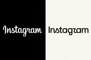
In August 2026, Instagram quietly refreshed its logo. Not the camera icon, that stayed put, just the cursive wordmark that’s been sitting under it for a decade. A small, low-stakes tweak, the kind of thing a design team probably spent months debating internally and expected zero people to notice.
The internet noticed. Within hours, the new lowercase “r” had fused visually with the “g” next to it, and half of social media was convinced the app now spelled its own name “Instagzam.” Then came “Instagwam.” Then “Instaguam,” for reasons nobody can fully explain. Adam Mosseri, who runs Instagram, called the change “cleaner and more modern” in a post announcing it, which is exactly the kind of sentence that ages badly within a day.
It’s a funny story on its own. But it’s also the latest entry in a much longer, much pettier genre: companies changing something nobody asked them to change, and the internet making them regret it. Sometimes the backlash is background noise. Sometimes it’s a warning shot the company should have listened to. The tricky part, and the actual subject of this piece, is that you often can’t tell which is which just by looking at how loud the mockery gets.
Why “Instagzam” Actually Happened
The typo-that-wasn’t-a-typo has a pretty simple explanation once you look at the letterforms side by side. The old wordmark kept its “r” and “g” visually distinct. The new one leans harder into a single continuous cursive stroke, and when the diagonal tail of the r rolls straight into the bowl of the g, your eye does what eyes do with ambiguous shapes: it reaches for the nearest thing it already recognises. For most people scrolling at arm’s length, that nearest thing is a z.
There’s a more interesting thread hiding underneath the joke, too. Plenty of the online commentary leaned into a “kids can’t read cursive anymore” narrative, and there’s a real, if messy, data point behind that instinct: cursive instruction has been quietly declining across the US, Canada, and parts of Europe for years, so the joke landed on a nerve that was already exposed.
That said, it’s worth resisting the tidy version of this story. Plenty of design critics pushed back on the idea that this is really a Gen Z literacy problem at all, pointing out that ambiguous, overlapping letterforms will trip up readers of any age when a wordmark prioritizes flourish over legibility. In other words, the logo didn’t get harder to read because young people forgot cursive. It got harder to read because it’s genuinely harder to read.
The “Why Touch It At All” Question
Here’s the thing about Instagram’s logo refresh, though. Once the jokes die down, it isn’t actually a big deal. The icon didn’t change. The colors didn’t change. Nobody’s grandmother is going to open the app store looking for the old one and fail to find it. It’s cosmetic, and cosmetic changes have a pretty forgiving safety net: if people hate it, you quietly revert a wordmark and nobody remembers it in six months.
Compare that to Jaguar. In late 2024, the car company didn’t refresh a logo, it gutted its entire brand identity, and it did so on purpose, as a personality transplant rather than a paint job. Jaguar had spent decades as the choice of, in the branding world’s own phrasing, a “masculine,” heritage-obsessed, largely British buyer who wanted a car that felt like old money. The rebrand deliberately walked away from all of it, chasing what Jaguar’s own leadership described as a “design-minded, cash-rich, time-poor” younger audience who’d never bought a Jaguar in their life. The teaser campaign that announced this shift didn’t show a single car, just models in colorful outfits standing in empty rooms, alongside a tagline, “Copy Nothing,” lifted from founder William Lyons. Even Elon Musk couldn’t resist asking the obvious question in public: “Do you sell cars?”
Here’s the part that makes Jaguar different from every other case study in this piece: the company didn’t stumble into alienating its base, it planned to. Jaguar’s own brand chief, Rawdon Glover, said upfront that the company expected to keep only 10 to 15% of its existing customers through the transition. That’s not a rebrand that miscalculated the backlash. That’s a rebrand that budgeted for it, on the theory that the old customer base was aging out anyway and the brand needed a completely new personality to survive its next century.
The market’s response wasn’t a meme cycle, it was a balance sheet. By April 2025, Jaguar’s European sales had dropped 97.5% year-on-year. Not a rough quarter. A near-total collapse. Some of that decline is genuinely a supply story rather than a demand one: Jaguar had deliberately paused production of its entire lineup ahead of the EV-only relaunch, so dealers had almost nothing left on the lot regardless of what anyone thought of the new ads. But that supply gap was itself part of the same personality transplant, the company cleared out its old identity, old products and old customers all at once, betting that a new luxury audience would show up before the old one finished walking out the door. Jaguar’s leadership didn’t exactly treat any of this as a crisis, either: one executive argued that people were talking about the brand more than they had in years, so from where he sat, there’s no such thing as bad publicity. Whether “everyone is talking about how we disappeared” counts as a marketing win is a question I’ll let you sit with.
The gap between Instagram and Jaguar is really the whole thesis of this piece in miniature. One touched the letters. The other rewrote its entire personality and dared its own customers to leave. Getting mocked online happened in both cases. The actual consequences did not look remotely the same, and worth flagging now: Jaguar hasn’t reversed course, but “didn’t reverse course” and “it worked” are not the same claim, a distinction we’re going to keep coming back to.
The Reversal Club: Gap
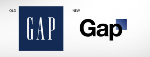
If you want the platonic ideal of a rebrand nobody asked for, Gap’s 2010 logo change is still the gold standard, fifteen years later. The company swapped its classic, boxy wordmark for a generic sans-serif logo with a small blue gradient square floating off to the side, the kind of design you’d expect from a mid-tier tech startup, not a mall retailer with decades of brand equity.
The backlash was immediate and, honestly, kind of impressive in its speed. A parody Twitter account appeared almost instantly. A site literally called “Craplogo” let anyone generate their own version of the new mark as a joke. Gap even tried to save face by crowdsourcing a replacement design from the public, which also failed. The whole saga coincided with roughly $247 million in stock value lost, though that figure lines up with a disappointing sales report Gap put out around the same time, so the logo wasn’t necessarily carrying that number alone.
The logo lasted six days.
Here’s the detail that makes this story worth telling, though, and the one I think gets lost in the “haha, Gap panicked” retelling: an Ipsos poll conducted just three days after the launch found that 80% of respondents hadn’t even noticed the logo had changed. Read that again. The backlash was loud, fast, and expensive, and the vast majority of Gap’s actual customer base had no idea anything was different. The reversal wasn’t really a response to broad customer sentiment. It was a response to a very loud, very online minority who happened to have the internet’s full attention that week.
The “Ignore It And It Works Out” Club: Airbnb
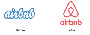
Airbnb’s 2014 rebrand got roasted just as hard as Gap’s, maybe harder. The new logo, a looping symbol the company called the “Bélo,” was widely mocked online for looking like body parts that had absolutely nothing to do with vacation rentals. It became an instant punchline, complete with the requisite wave of parody images.
Airbnb did not revert it. Not after six days, not after six months, not ever. Rick Barrack, chief creative officer at the brand agency CBX, told Fortune at the time that the outrage would go away very quickly, and that Airbnb should stay the course rather than react to it. That’s exactly what happened. The Bélo is still Airbnb’s logo today, over a decade later, and most people who use the app couldn’t tell you the internet ever found it hilarious.
This is the case study that should make you slightly uncomfortable with the “always listen to your customers” instinct, because here, listening to the loudest reaction would have been the wrong move. Airbnb didn’t have Gap’s problem, either: nothing about the new logo asked people to relearn how to find or use the product, it was purely a symbol sitting next to a name that hadn’t changed. The backlash was real, it just wasn’t about anything that mattered to the business.
X: The Rebrand That Didn’t Mark the Spot
And then there’s the rebrand that makes Instagram’s font tweak look positively cautious by comparison.
In July 2023, Twitter became X. Gone was the bird. Gone was the name. Gone, within a couple of years, was any pretense that this had been a strategic branding decision rather than an announcement of ownership. Twitter hadn’t just built a product, it had built one of the small handful of brand names that became a verb in everyday use. We tweet the way we google something or uber home from a bar. “Tweet” made it into Merriam-Webster in 2011. That is about as high as brand equity gets, and it’s exactly what got thrown out.
Years later, the numbers make it pretty clear the new name never actually landed. A 2024 survey of British adults found that 70% still called the platform “Twitter,” compared with just 4% who said “X.” Even among people who used X daily, 78% defaulted to the old name. This wasn’t early-adopter lag that would smooth out with time. It held steady well past the one-year mark.
Then came the detail that really seals it: X Corp itself later filed a lawsuit to protect the Twitter trademark when a separate startup tried to claim it. Buried in that legal filing was the company essentially admitting, in writing, that Twitter never actually left and remained exclusively its own property. So the company that spent millions ripping the old branding off its own headquarters ended up in court defending its right to keep owning the name it had supposedly discarded.
Why didn’t this one stick, when Airbnb’s arguably weirder logo did? A few things were working against it at once. First, verb-brands are uniquely hard to dislodge, because you’re not just asking people to recognise a new logo, you’re asking millions of people to change how they talk. Second, the motive read as obviously personal rather than customer-facing. Where Instagram and even Jaguar at least gestured at a rationale about modernising for their audience, the X rebrand was widely understood as Elon Musk marking new territory, not addressing an actual user complaint. And third, there was no transition period. No “X, formerly Twitter” phase-in to let habit catch up with the branding. Just an overnight switch, followed by years of the world quietly refusing to follow along.
Plotting It All Out
Line these five stories up and a pattern starts to emerge that has nothing to do with how much mockery a company received, because every single one of them got mocked. What actually separates them is two different questions, and it’s worth being precise about which one you’re asking: how deep the change went, and whether the company kept it. Notice that’s not the same question as whether the change actually worked.
| Kept | Reverted / Never Adopted | |
|---|---|---|
| Cosmetic change | Gap | |
| Total overhaul | Jaguar, Airbnb | X |
Instagram and Gap both made surface-level changes and both got mocked, yet one was a total non-event and the other triggered a corporate reversal in under a week. Gap, notably, reverted a change that 80% of its own customers hadn’t even clocked, which tells you the decision to revert was about managing a loud news cycle, not about actual damage.
Jaguar and Airbnb both blew up their entire identities, got mocked just as hard, and both companies kept the new branding rather than backing down. But don’t let “kept” do more work than it’s earned here, because these two outcomes look nothing alike once you check on them a year later. Airbnb’s logo quietly became invisible in the best way, nobody thinks about it anymore, which is exactly what a successful rebrand looks like. Jaguar’s logo is still on the cars, and European sales are still down 97.5% year-on-year. One company held its nerve and won. The other held its nerve and is still losing money. “We didn’t reverse course” was true in both cases and meant something completely different each time.
X sits in its own corner: a total overhaul the company also never reversed, technically, X Corp is still X Corp, but one the public simply never adopted. Years later, most people still call it Twitter, and the company itself ended up in court defending a trademark on the name it supposedly buried. That’s a third distinct failure mode: not reverted, not embraced, just quietly ignored by the exact people it was rebranded for.
So “did they keep it” tells you almost nothing about whether the change worked. If backlash volume were the thing that predicted outcomes, these cells wouldn’t be scattered like this, and if “they kept it” were the thing that predicted success, Jaguar and Airbnb wouldn’t be sitting in the same box while pointing in opposite directions. What actually seems to matter is whether the change touches something the audience was genuinely relying on: a near-identical shape they navigate by habit, like Gap’s near-invisible swap, or an entire vocabulary built around a verb, like Twitter’s. Cosmetic tweaks and even bold total overhauls can survive a rough launch week just fine, as long as they don’t ask people to unlearn something they already know by heart. But “surviving the launch week” and “the rebrand actually working” are, as Jaguar proves, two entirely different scorecards.
The Actual Lesson For Marketers
None of this is really an argument for never changing anything, or for changing everything and hoping for the best. It’s an argument for asking a better question before you panic over a mentions spike.
A few worth asking before you decide whether the backlash means anything:
Is this actually showing up in usage or sales data, or only in sentiment and mentions? Gap’s stock took a real hit, but that was driven by media coverage of the backlash itself, not by shoppers actually abandoning the store, which the Ipsos number makes pretty clear.
Is the criticism about the design, or about what the design represents? Jaguar’s ads not featuring a car at all is a substance complaint, not a taste complaint, and substance complaints tend to matter more.
Does the change ask your audience to unlearn something? A shape they navigate by muscle memory, a name they use as a verb, a habit built over a decade. If yes, you’re playing a much riskier game than a font tweak, no matter how confident the internal pitch deck sounds.
And maybe most usefully: has anyone actually checked whether the loud reaction represents your customer base, or just the segment of it currently online and typing? Gap’s answer was 80% of people who hadn’t noticed a thing. It’s worth finding your own version of that number before you decide the internet has spoken.
Instagram’s wordmark will probably be forgotten within a month. Jaguar’s ad campaign will get taught in marketing classes for the wrong reasons for years. And X, all these years later, is still fighting in court for the name it tried so hard to bury. Turns out the hardest part of a rebrand was never the design. It’s figuring out whether anyone actually wanted it fixed in the first place.



 Cookies configuration